Sunday, November 13, 2011

Paint and Light

photo courtesy of startribune.com

A couple of weeks ago, I met with a woman to help her get started on a home remodel.  She has a beautiful home but her taste has changed over the years from the 'country clutter' look to something more clean and sophisticated.  She didn't even know where to start.

After an hour of meeting with her, we began to formulate a plan to begin a transformation of her home.  She hated the paint.   In theory, the paint on her walls was suppose to be a neutral taupe but it had such a strong red base that the walls emitted a strong pink undertone.  After lots of questions and introspection, it was decided that really, that paint was causing the biggest problems for her.

We chose a new neutral and she was off and running...well, until I got a call this week that they hated the paint color I chose for them.  I went right over to see what it was they hated.  It wasn't hard to figure out what the problem was and it wasn't the paint color. 

No, it was the lighting and the fact that they were judging the new color with a gold/green base beside the old pink color.  Of course the gold tones will look more shocking when placed next to pink. 

The second problem was their lighting.  In the bathroom fixtures, they had part incandescent and part fluorescent lights.  Incandescent gives off a warm light and flurorescent, a cool light.  The mixture and play of warm and cool was giving the paint a very strange tint that seemed to change as the natural daylight changed. 

I suggested that since they had only painted a bedroom and an adjoining bathroom, they needed to paint the hallway and change out all the lighting back to uniform incandescent before deciding if we change the paint color. 

The homeowner got busy and the next day when I checked in on  her progress, she was thrilled with the same old color we had chosen. 
Remember, light, space, and paint base makes all the difference in the world when it comes to choosing color.  Before jumping in with both feet, it's always wise to get a few sample paint pots and paint a small patch so you can observe how the natural light can change the intensity. 

Have you got a paint color problem in your house?  Get in touch and let's make it right.

Monday, November 7, 2011

Cleaning Tip

Don't you just love cleaning?  What?  No, you say?  Well, neither do I even though it is something I have had to rely on cleaning other people's homes this past few years.  I dread having to go but once I leave a house, I am happy to see a nice, clean sparkling environment and that makes it worth it.  But, then I have to come home to my own mess!

Today's tip is cleaning the drip pans on the stove.  What a mess those can become.  All it takes is one over excited boiling pot of spaghetti noodles to created a burned on mess.  Here is the easiest way to take care of such messes and requires no scrubbing.   You will need:
A plastic grocery bag
Can of oven cleaner
A little bit of time

First of all, take your drip pans and place them one by one in the bottom of a plastic grocery bag.  Once one pan is in the bag, spray it well with oven cleaner then stack the next drip pan and repeat the process.  Stack and spray, that's all there is to it.


 Once they are all sprayed down, tie the bag up and walk away.  The longer you can let them sit, the easier they clean.  I usually do mine right after the last meal of the day and either let them sit until I go to bed around 11, then put them in the dishwasher and start it or, I let them sit overnight and then rinse them clean in the morning.


This particular time, I let them sit overnight, then just rinsed them off in the morning.  Look how clean they end up!  They look brand new but these are actually about 5 years old.

Wednesday, November 2, 2011

Space Planning

Space Planning is EVERYTHING!  Unfortunately, when the housing boom was going on, contractors put up a house in weeks, rather than months.  The consumer comes along, takes advantage of the great deal but doesn't really consider if the house will function well with their family and lifestyle.  Often the 'curb appeal' takes precedence over the space or we realize some of the spaces won't work but we decide to sacrifice and make do.  Big Mistake. 

That's what I did.  Because of circumstances, I had just two weeks to find a home for the kids and I.  This home has some great spaces but some pretty dysfunctional ones.  I, like many, decided to make do.  Now, I regret to some extent the decision I made.  

Take for instance my 'office'.  When I moved in, there was no place to put a computer so I created a desk in my bedroom as shown in the picture below. 


It functioned well enough but I got sick of the constant mess and people coming and going from my room.  This past summer, I decided to make a change.  The computer ended up here...

In the hall closet.  I liked some features of this little nook.  I could shut the door on the mess and no one was in my room at all hours of the day and night working on homework.  Not a great space because it was too small if two people were sitting at the computer.

Recently, I came up with this solution. 


We have a loft in our house that is too small for much of anything.  While I didn't want my office upstairs, it really was the best solution and best use of space.  I built a corner desk unit so that we can house two computers, one for Shelbie and one for me and my business.  The filing cabinets also fit well which was a problem with the closet location.

In the past, I use the loft as my sewing/craft space too.  Well, my solution to that was to keep it there but behind the closed doors of an old computer armoire.


That has worked out great!  When I am working on a project, I pull out the keyboard tray and place the sewing machine on it then close it all up when I'm done.


The corner desk was really easy to construct.  I had two long 'card' tables so I put them edge to edge.  That left a big hole towards the back where there was no table.  I went to the lumber yard and asked for some 'throw away' pieces.  They had some particle boards that they sold to me for $2 and even cut them to fit.  I cut one the length of the table plus the empty space at the back.  The second piece I cut to fit the second table. 

I made a fitted covering complete with ruffle. 

It was so easy and didn't take all day to complete.  It has been so much better. Even still, I can't wait for the day when I can design a house that actually meets our needs, all of them, even the small ones.

Sunday, October 30, 2011

The Old Screen Door

What a find...this old screen door! When I bought it, I had big plans for it.  It makes the most perfect message board for our family.  The screen is wire so pictures, memos and messages can be attached with fun magnets.  I love it! 

So, using a wire brush, I cleaned up the frame, got all the old dirt and chipping paint off.


Our family has a mantra that I wanted to have on the top of the screen so I chalked it on.  You can barely see it in this picture.


Next, taking embroidery floss and using a backstitch, I stitched our saying onto the screen.  It was so easy and didn't take long.  Our mantra is from the movie Land Before Time..If we hold on together
The photograph is not the greatest and doesn't really do it justice.


I bought a small roll of aluminum screening to add some embellishments


Again, it's hard to capture a photo of wire mesh.  Using a simple flower pattern, I cut out several from the wire and layered them together then stitched them onto the screen day on the bottom half.


I added some stitched stems and voila!  It is the cutest board ever!


So, what if you don't have a screen door like this?  Well, imagine repurposing any small screen from a window or staple aluminum screen onto the back of an empty picture frame then stitch your own message into it.  It's fun for teenagers to display all the pics of their friends or young kids to display their artwork.  There are lots of unique possibilities and would make a fun and unique Christmas gift.

Monday, October 24, 2011

Get Organized

Fall is typically the time of year that we take on the deep cleaning of our homes.  It's when we finally break down and tackle the blinds and the base boards.  I love de-cluttering and deep cleaning.  When the task is done, a real sense of accomplishment and peace resides in the place where junk once was.

It seems I do a lot of deep cleaning many times a year.  Closets and cupboards can quickly get out of control if we don't stay on top of it.  The last few months, I have been working on a few problem areas of my home.  One of the biggest messes was my laundry room.  Here are some before pictures.
My cleaning supplies end up conveniently on the floor and a mess of too small jackets and other junk hang on the hooks

The shelf above my washer and dryer were filled with who knows what.  I seemed to have a nice collection of random products I never use but somehow acquired every time a neighbor moved away.

These photos don't really do the mess justice.  My laundry room is basically a deep closet off a narrow hallway so it was hard to get far enough away for a full shot at the room.   After a little work and lots of bulging garbage bags later, it's a room I can live with for now.  It still needs some improvement but this is a good start.


I got rid of my extra vacuum so I only have to house one here.  The mops and brooms are neatly hung and the coats that didn't fit anyone are now in the hands of someone who can use them this winter.

I eliminated all the products I don't use and just keep my current cleaning supplies on the shelf. 

 What's left to do? Lots!  I'm still not happy with the space but transformation takes time. As I go out into people's homes, they often seemed overwhelmed with so many things they want to change.  It's important to take it all in stride.  Rather than go into a debt of time, or money, do little things a little at a time and soon the pay offs will be big. 

Tuesday, October 18, 2011

Working the Color Trends

So, are you ready to embrace the new bold colors for next year?

Photo from Pantone
 

I have this to say about trends of any kind.  Do not be intimidated by the latest fad. Do not feel pressured to include every trend in your home.  I often run across people who want to change the paint in their living room but are so worried they will make a mistake that will be dated next week so they tend to gravitate to the current trend or think if it's good for Pottery Barn, then it must be good for me. 

Trends will eventually be dated.  That's their job, they come, they go.  My philosophy as a designer is that your home should reflect you.  Your values, your morals, your character and all of your beliefs.  It should not necessarily reflect the political climate of the country in which you live, the environment or even your next door neighbor's taste. 

Creating an 'honest' environment in your home is never out of date.  It speaks volumes and people who come and go will feel your spirit. 

Sometimes, it's fun to try something new and trendy.  Invest in the little things that have little cost associated with them and are easy to switch out when you tire of them.  Pillows, for instance can pack of lot of design punch.  They are a fun surprise and easy to make or inexpensive to buy.  You can never go wrong with updating pillows.   Make them fun or keep them sophisticated.  Whatever you do in your home, make it yours!

Monday, October 17, 2011

Color Forecast

Did you know that the color trends for 2012/13 have already been released?  For some of us, we are just barely getting on board with this year's color trend.  How do they decide on the color trends and who decides what's hot and what's not?

Well, Pantone is the leader in the science of color but companies like Sherwin Williams and Benjamin Moore, along with others make their forecast as well.  Generally speaking, each forecast is complementary to one another. 

Color trends are cued by many environmental factors such as the economic climate even the political climate.  In 2008, an election year, the hot color was yellow.  Yellow represents change so it really made sense especially considering we voted in our first Black President.  This country back then was all about change.

2011, our colors were all representative of ESCAPE!  How fitting since we are all trying to escape the bad effects of a limping economy.  Colors leading up to 2012 are bolder, brighter and give a sense of reclamation, even enlightenment.  Faith and belief is big, the battle between light and dark continues.  It's time to take back control and rediscover the values this country was built on. 

Colors for 2012 are about refocusing on what's important, preserving what we have and being enlightened.
  • Neutrals will be a big part of color this coming year and we welcome back a strong neutral
  • Black!!  Yes, black is the new black!! 
  • Metallics will be big and gold makes a come back but silver is still strong.
  • Anything worn, irregular, handcrafted, recycled and repurposed is hot, very hot! Think preservation!
  • Colors will be grayed and weathered
  • Red- think brilliance, passion ie. chili pepper and clay.
  • Blue- Turquoise, and Teal...it's been awhile since we saw teal.
  • Greens- symbolize healing.  They will be bright like lime but also seafoam and moss.
  • Browns- become more important, this is the reclamation part of the color trend representing grounding and deep rooted.
  • Yellow- warm, bright and staturated with color.
  • Pinks- bubblegum pink, bold and bright
I love this color pallette!  It's fresh and fun but I especially like the theory behind the colors.  Nothing is hotter right now than repurposing things and breathing new life into the old.  I'm hoping to build on this even more in the coming year than I have this year.

So, how do you feel about the color scheme for 2012?

Friday, October 14, 2011

Energy Efficiency- part 3

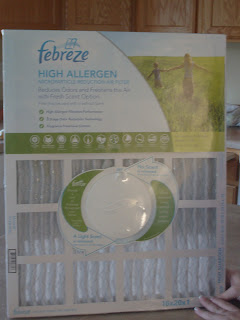
Here's the final energy tip for the week.  When was the last time you changed your furnace filter?  If you can't remember the last time, it's probably time for a change. 

Did you know that filters should be changed every single month?  That is if you are buying the very inexpensive $2 or $3 dollar filter.  There are some filters designed to last three months, sometimes more depending on the manufacture.  Of course you are going to pay more for these types of filters.


I found this style with a febreze air freshener in it and it lasts 3 months.  I do not have time to remember each month to change my filter so this better fits my needs. 


Nothing like airing my 'dirty' filters!!!  This is the old filter I pulled out of my furnace.  It's been sitting in there since Spring.  That is not the color of the filter, that is dirt!  Disgusting. 

Here's another tip...If you hold the filter up to the light and you can't see the light through it, that's a bad thing!!

Why change the filter?  Well, if you think about it, a filter is meant to, well....filter!!  It's job is to filter dust and other allergens from your home.  Keeping the filter clean will help your furnace run with greater efficiency and keep your house cleaner.  A cleaner filter means less dusting!!   The harder your furnace has to work because of a dirty filter, the higher your utility bills!

I know all of us can save money on heating bills...change those filters.

Wednesday, October 12, 2011

Energy Efficiency part 2

There is another place in your home that lets in a huge amount of drafts and I bet you never knew!  Outlets!  They are big culprit for lost energy.  Test it out next cool day you experience.  Sometimes just putting your hand against an outlet or switch is enough to feel a draft. Sealing up the outlets is super easy.

Again, I started with a DIY kit from Duck.  Duck has all sorts of weatherstripping kits and they are very affordable.  Depending on the size of your house, this kit came with enough to do just about all the outlets in my house. Exterior outlets. 


The material is a spongy, insulation.  Each outlet sealer is in a perforated strip so just tear them off as you need one. 


They fit snugly over your outlet.  Once in place, secure the plastic outlet cover as usual. 


This may seem small and insignificant but it can make a huge difference in your heating bill.  I don't know about you but it's more often the draftiness that makes you chilled to the bone.  Here's hoping winter stays outside instead of inside this year!

Monday, October 10, 2011

Energy Efficiency

 Perhaps you're one of the lucky ones living in a new home or at least a well crafted home.  I am not that lucky.  My house is so drafty all year long.  See the big gap at the top of my front door? 

When it rains, we feel it.  When the wind blows, we feel it.  When the snow flies, it flies through the cracks in the doors.  It is not uncommon for frost to collect at the bottom of my door in the winter. 

 Ideally, I should replace the door, replace the windows, and do a bunch of other things to improve the quality of the house but that is just not feasible right now.  So, the next best thing is to take some steps to at least save the energy I can from escaping and the elements coming in. 

The first thing I did was add weather stripping to the front door.  Nothing could be easier and takes no time at all.  There are plenty of weatherstripping kits to choose from.  I chose a thicker size because it's a sizeable gap. 


Just follow the manufacture instructions which usually involves some easy trimming with scissors.


Clean the door frame with alcohol wipes to ensure a good, tight fit with the adhesive and the wood frame.


Simply apply the adhesive strip.  Voila!  Easy.  Sometimes just stopping the draft makes a huge difference. 

All this week, I will posting more tips on improving the energy efficiency of your homes, easy DIY that make a big difference. 

Thursday, October 6, 2011

Interior Designer vs. Interior Decorator

The two terms designer and decorator seem to be used interchangeably but there are some significant differences between an interior designer and an interior decorator. 

An interior decorator is someone with a knack for accessorizing, combining colors and patterns and has a keen sense of style.  They generally do not have education in the interior design field though they may have taken a class or two.  I have met some decorators who excel at making spaces look great!  Decorators have a place in the market that's for sure. 

In my comings and goings over the years, I run into a lot of people who say, "Can you help me figure out my living room?  I have no clue what I'm doing."  When I meet with them to see the mess I assume they've created because they talked themselves into a ditch about their talents, I find that most people really do know what they're doing.  With a little tweak here and there, it looks great.  Don't second guess yourself when it comes to decorating your home.  There's a decorator in all of us...tap into that.

An interior designer is someone who may or may not have a knack for accessorizing, combining colors and patterns but do typically have a sharp eye for detail and style.  Most importantly, a designer has education; typically 4 years worth and more.  They can have a general, broad education or specialize in a certain field of work just like a doctor.  There are kitchen designers,  health care designers, office systems designers and the list goes on. 

A designer's education is very much like an Architects in fact, a designer can do everything an architect can do with the exception of calculating loads; snow loads, shear walls, the technical stuff.  A designer learns all the principles of good design, space planning, fire codes, building codes and codes for the disabled.  We learn it all and the time spent in school is far more difficult and intense than one may think. 

I am a designer specializing in space planning.  Sometimes, using an interior designer to design your home and office makes more sense than going straight to the architect.  Architects can be pricey.  If your budget is tight, you can often get the space planning and other drawings done by a designer then just pay the architect for the technicalities and it will save you a ton of money in the end.  A designer will work with contractors and other subs to see the construction of your home through. 

So, as your need for design help increases, keep in mind the subtle differences and get the most out of your money!

Wednesday, October 5, 2011

Wreath wrap up

Hopefully, you enjoyed the tutorials this past week.  Sometimes, the smallest things make the biggest difference in the design and look of your home.  None of the wreaths had a lot of cost involved but offered great returns in the style department. 

Through this interior design blog, you will come to learn some great tips for home repair, do it yourself design and articles to help you create a space that is relaxing, inviting and inspiring. 

This winner of their choice of wreath is Tanya C. 

I am looking forward to the growth of this blog and my new company, Inside Story.  Hope you stick around and learn some new things.

Monday, October 3, 2011

Burlap Wreath

Here is the final wreath in my Fall wreath series.  Burlap is a hot trend these days in the world of interior accents.  Again, this wreath is easy and inexpensive.

Supplies needed:
     12" Wreath form
     Burlap strips- One 10"wide by 92" long
                           One 8" wide by 92" long  (You can use two pieces 46" long if you don't have enough length in your yardage)
     Muslin strip- 3" by 80 inches.  Again, you can use smaller lengths and just glue them together
     Chiffon scraps for small flowers
     Hot glue gun and glue sticks
     Needle
     Heavy Thread
     Small brads or beads

First start by wrapping your wreath form in the muslin strip.  You can substitute muslin for linen or burlap.  Secure the ends with hot glue.


Press your burlap strips in half lengthwise then begin stitching a running stitch in preparation for gathering.


Gather up the burlap on both strips.  Adjust the gathers along the wreath before securing with glue


Glue the widest strip down on the wreath first. 


Add the last strip on top of the first, gluing carefully.


Take your linen strip and sketch out a flower design.  I chose a 5 petal flower.  Fold up the fabric and cut out the shape all at once. 


Stack the petals in groupings of three and use a small dot of hot glue to tack the layers.  Add a small brad or bead to the center.


Glue the flowers in place on your wreath.  You can use more or less depending on your taste.


Here is the final wreath.  It is not only cute but sophisticated.  I love the combination of the heavily textured burlap and lightness of the chiffon


So, now that you have learned three new wreath techniques, I hope you are able to create some of your own. 

If you want to be entered in the drawing to win one of these wreaths, leave me a comment on one or all of the wreath tutorial posts and tell me which one you like the most. 

For a second entry, go to my Inside Story Interiors Facebook page and 'Like' it, or you can link this post on your own blog if you don't have Facebook.  Come back here and tell me that you linked this post or 'liked' my Facebook page.
Make sure to check back here on Wednesday to see who the lucky winner is and make sure you contact me with your address info so I can get the wreath to you!!  Good luck!

Friday, September 30, 2011

Twiggy Wreath

This is part two of my wreath tutorials.  This is by far my favorite wreath!!  When I set out to make this wreath, I didn't have a clear image in my mind of how it would look in the end.  I knew the elements I wanted it to have and once I started collecting the material, it just sort of evolved in my mind.  The best thing about this wreath is that it cost me virtually nothing to make.  I had everything I needed on hand or out in nature.  Here is a picture of the finished wreath.


Now, here is what you need to make your own!
Supplies:  branches collected from dead trees
                an old book you can cut up
                bowl of water
                hot glue gun and glue
                twine
                seed beads
                scissors and exacto knife

I headed out to one of our local parks to collect my branches.  I only selected branches that were dead and laying on the ground so no living trees were destroyed in the process. ;-)  I chose branches that had a nice, gentle curve to them. I liked the fact that one branch even had a couple of dead leaves still attached.

Arrange the branches in the manner you would like in the shape you want.  My wreath is in an asymmetrical shape.  I like to try new things and a deviation from the round wreath is a nice change.

Once you like the way the bundle looks, secure the branches with some twine.  You may also need to add some hot glue it the twine is not enough.


 Next, take your old book and remove several of the pages either with an exacto knife or by tearing.  Be careful if you choose the exacto knife method so you don't get cut.


Cut several random shapes that only need to resemble a circle.  The less perfect the better.  I cut 4 different sizes so I had a nice variety to choose from.  The number will depend on how many flowers you want to make.  I would cut out at least 12 of each shape and size.  Since they don't have to match, you can cut several out at once by stacking the paper. 


Next, soak the cut flowers in a bowl of water just for a few seconds until they feel less stiff.  My paper was old and thicker with a lot of binders in it so I soaked it for about 15 seconds. If your paper is thin, you may only need to get it wet for a second or two.


When taking out the flower, crumple it up to gently squeeze the excess water out.


Un-crumple them but don't flatten them and leave them out to dry.  This gives them some nice, aged dimension.


Place a dot of hot glue in the center of a large petal then layer with a smaller petal, another dot of glue then another small petal.


The glue is hot so I use the end of a pencil to press the centers together


Add another drop of glue to the center of the top petal and drop in some seed beads.


Arrange the flowers on the wreath.  Clusters of odd numbers work the best. Use hot glue to secure the flowers to the twigs.  If you want, you can trail some flowers down the extra twine, if not, just trim the ends of the twine


So, what do you think?  I love this wreath.  Unfortunately, the pictures don't do the beauty of these flowers justice. 

You have to try this!